(Album ©1981, Columbia Records)
This record was an absolute phenomenon, 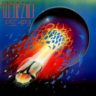 catapulting Journey from a mid-tier ’70’s band into a chart-topping multi-platinum ’80’s phenomenon. It spawned 4 Billboard Top Ten singles, plus my favorite Journey song (not one of those 4 Top Tens), “Stone In Love.” So suddenly, when I was 12, Journey was a band I had to pay attention to. In fact, I couldn’t avoid them – the aforementioned songs on the radio, videos and old concerts on MTV, and even a video game. They were suddenly everywhere.
So I started paying attention to Journey, after having avoided them in large part up to then. They had always sounded a bit glossy for my tastes, but the hooks on this album were infectious and the sound was fantastic. And in paying attention, I noticed the cover of this record. The color was bold and rich. The way the artist used light was dramatic and so detailed. Even the typography is eye-catching – I always enjoyed knowing that the album was spelled “E5C4P3.” And the band’s name was spelled twice – the larger name is written sideways and vertically (turn the cover 90 degrees clockwise and the letters read from top to bottom). I guess the record company was worried that people wouldn’t recognize the name, so they re-printed it just above, left-to-right and properly aligned, in smaller letters. Still, it was fantastic graphic design. Who was this artist?!?
I started looking in the record stores and found a number of earlier Journey albums had similar artwork – bold colors, scarabs or phoenixes, space. Clearly, Journey was working with a person album after album. But who was this artist?!?
I didn’t find out then – there was no Internet, so there was no Allmusic.com, no Wikipedia, not even a Google I could type in “cover artist for Journey’s Escape album” and find the names Stanley Mouse and Alton Kelley. Kelley was a graphic designer and Mouse is an artist. Mouse got his start in San Francisco creating customized t-shirts for car shows as a teenager, 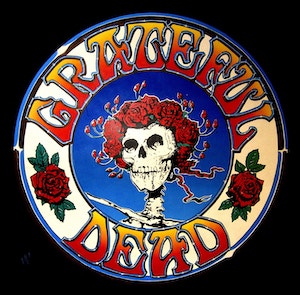 and soon moved to San Francisco, where he started creating concert posters. He partnered up with Kelley and they started creating the concert posters for the Grateful Dead. The skeleton with a crown of roses – that was them. They moved on to album covers – for the Dead, Steve Miller, and then Journey. They did four album covers for Journey, culminating with the Escape cover. Amazing.
How do I know this much about Stanley Mouse, you may ask? I watched this 9+ minute video about him and read this more-informative article in the Washington Post.
Twelve million copies sold, six singles released, including Billboard Top 10 hits “Don’t Stop Believin’,” “Who’s Cryin’ Now,” and “Open Arms.” This album completed the band’s transition from prog rockers (having been born out of the original Santana band back when Santana was still a jammy, jazzy rock band in the early ’70’s) to mainstream rockers.
This album seemed omnipresent in 1981 and ’82, and “Don’t Stop Believin'” was brought back into the public conscience (and maybe over-exposed again) by not one but two TV Shows! First, The Sopranos ended their final episode in a fairly strange way, smash-cutting to black as Meadow Soprano ran into the diner to meet her family who were already sitting and eating onion rings while the song played on the jukebox throughout the final scene, which ended on the line “Don’t Stop.” Then, only two years later, Glee sang it in the Pilot episode, and then a bunch more times during the series, and then the song was everywhere again.
But as much as the music on this record, it’s the cover that knocked me out then and still does. Vibrant, saturated colors and a real sense of movement propel this image into the pantheon of great album covers.
The cover looks dated to me. Like the Duran Duran Nagel covers in the 80’s.
I guess – but I love really strong graphics, as you’ll see coming up…